If you would like custom logo design and other graphic design services, contact me at hi@karapeters.design.
Idube Game Reserve (South Africa)
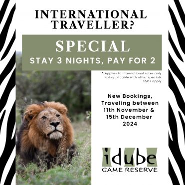
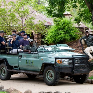
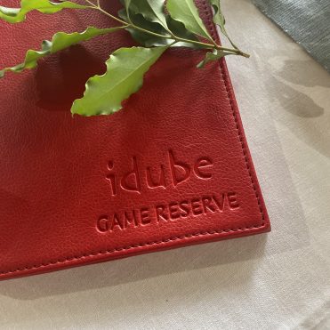
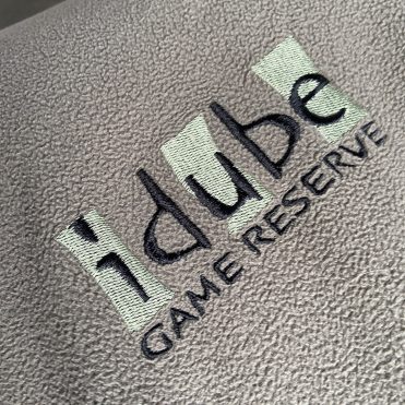
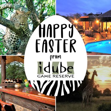
Idube is a multi award winning safari lodge in the Big 5 game area of South Africa, in the premier Sabi Sands Nature Reserve. Their previous logo needed simplifying as it was too detailed and did not scale well. I created the new logo with zebra stripes as a main feature because the word ‘Idube’ is a Shangaan word meaning ‘zebra’. The colors chosen are reminiscent of the those used on the safari vehicles and also the color of the African bush.
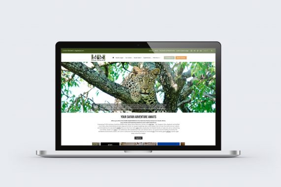
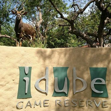
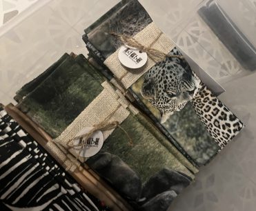
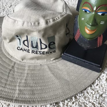
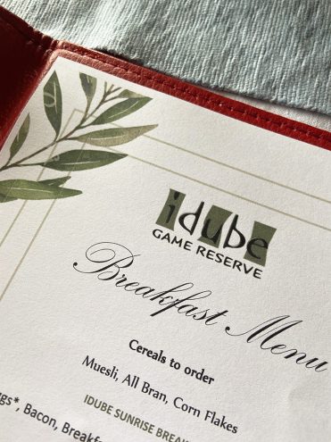
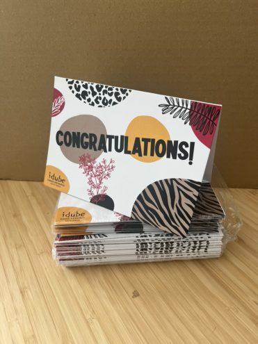
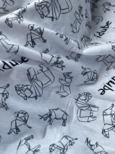
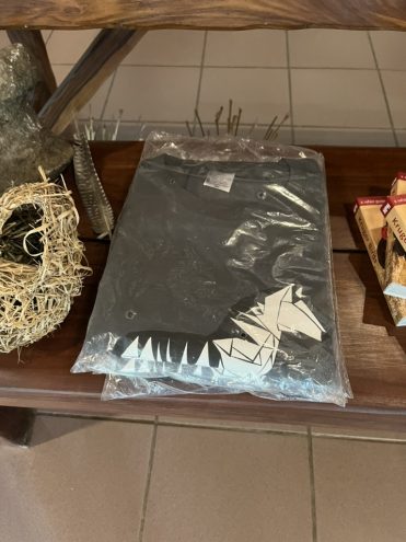
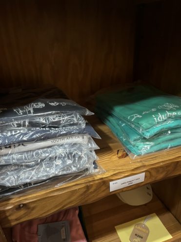
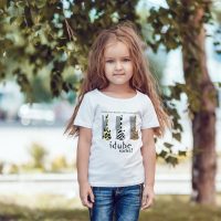
This logo is way more scalable as has been used successfully for many years now. From there, the branding project continued onto multiple website, signage, merchandise, vehicle branding, rates and information sheets, etc. I also used my surface design & illustration skills to create a range of Origami Big 5, zebra and kid’s t-shirts and these have had very successful sales in their curio shop. I currently handle all their online marketing, incl. brochures, presentations, flyers etc. Clients since 2001, Idube was my first client as a freelancer and we have gone through several re-designs of their websites with changes in technology and design style. The current website version was built on WordPress, as were some previous versions, with full installation, customization, SEO, plugin and template integration, HTML and CSS hand coding as needed. As of 2024, I work part-time as their Digital Marketing Manager and handle all the above plus any social media marketing, guest review forms, content for trade shows, photograph database, etc.
Wasabi Group (New Zealand)
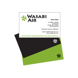
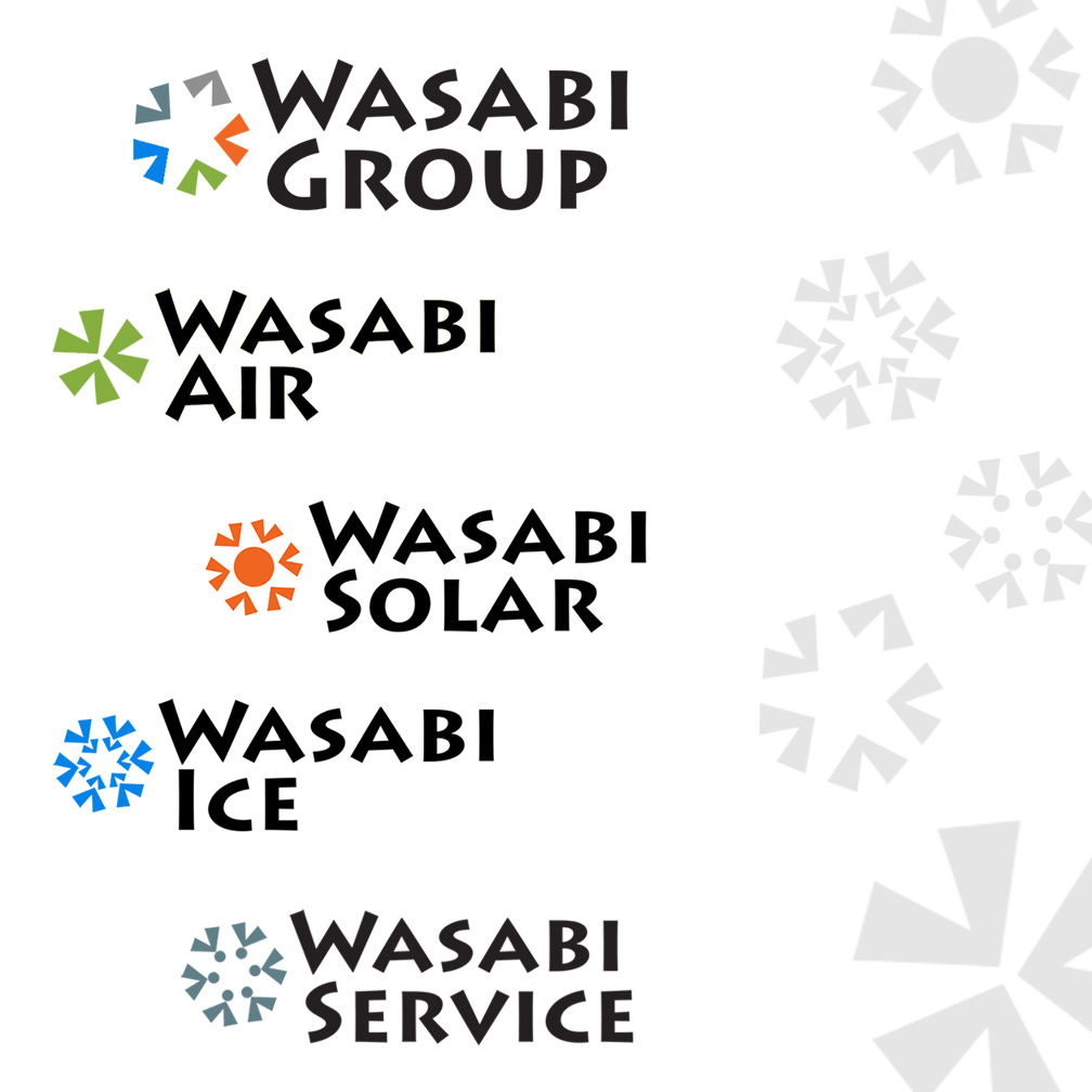
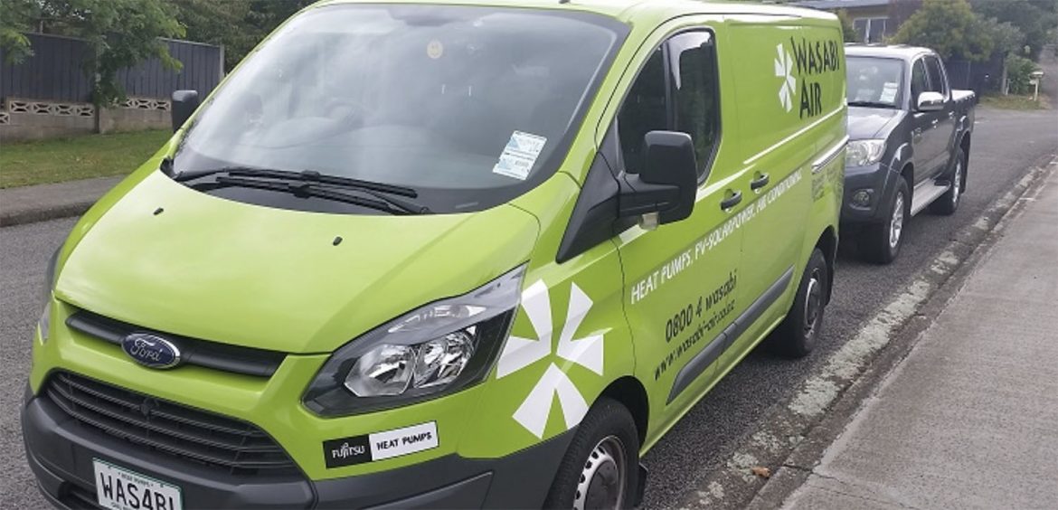
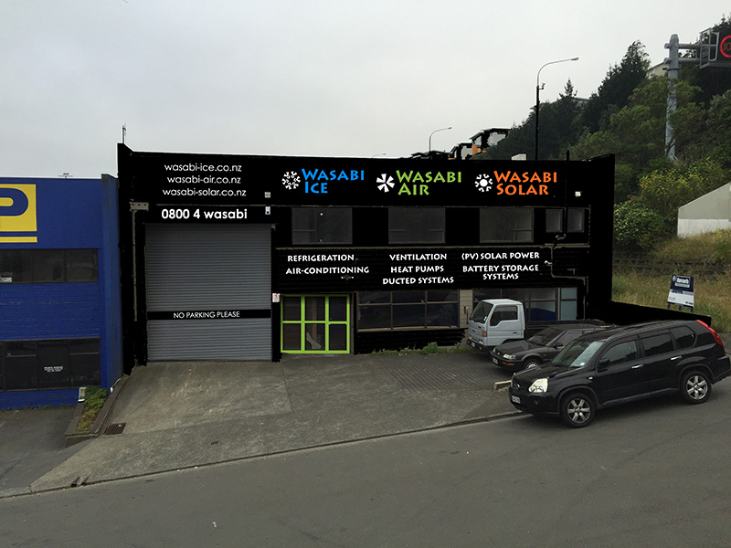
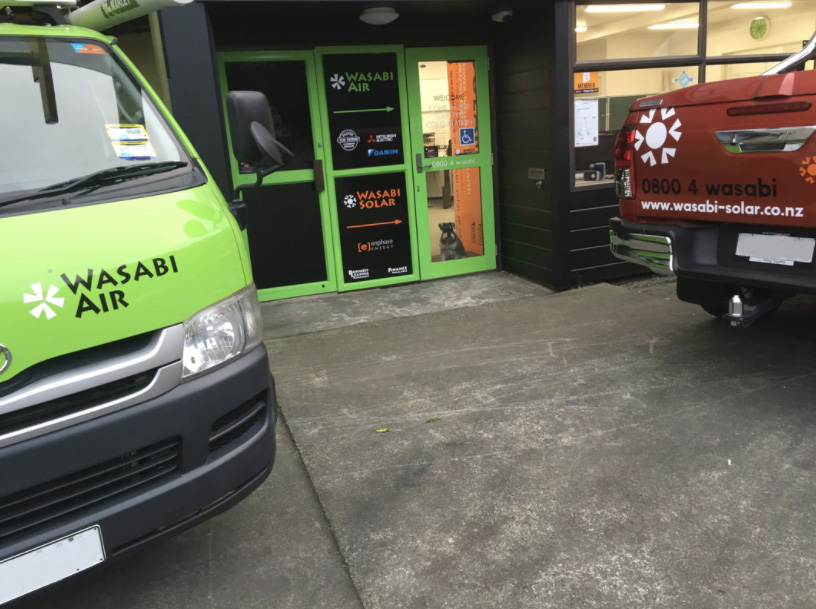
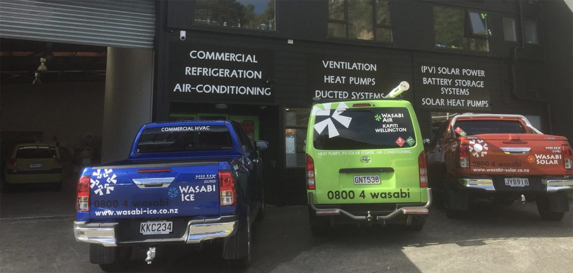
Wasabi Group is a New Zealand based client, which provides services related to heat pump, refrigeration and solar panel installation. Initially we started off designing a logo for their brand new company, Wasabi Air, and over time they added Wasabi Solar, Wasabi Ice, Wasabi Service and more recently the Wasabi Group was formed as an umbrella for the others. I made sure to keep the brand consistent, by using similar shapes to create a fan (for Air), sun (for Solar), snowflake (Ice), people (Service) and then combined elements of these for Group, with an arrow pointing upwards to indicate growth. Other work for the client included branding their new building, multiple vehicles, trailer, banners, business cards and their very first website.
TRIM (USA)
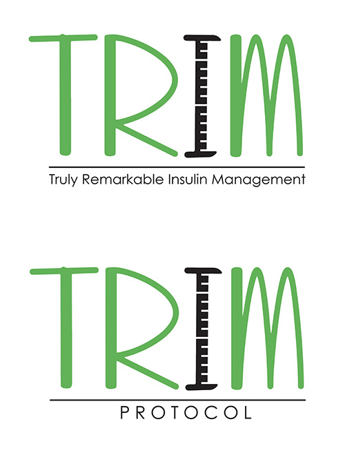
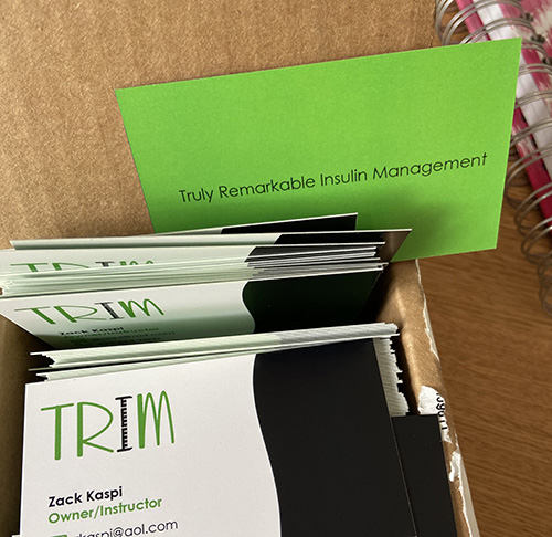
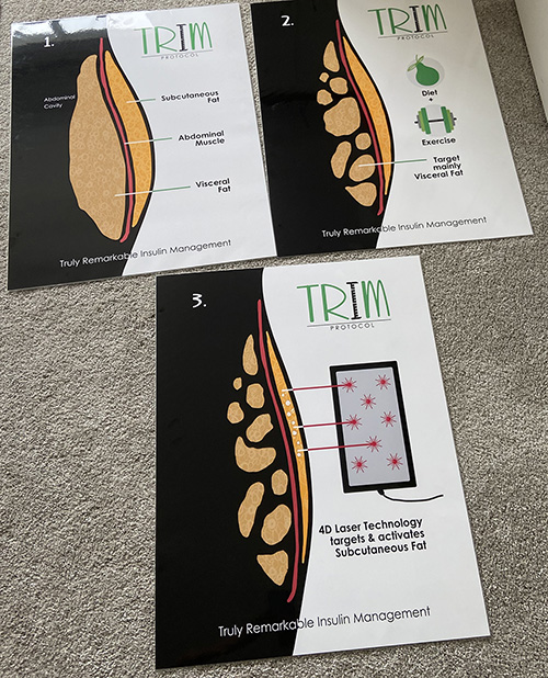
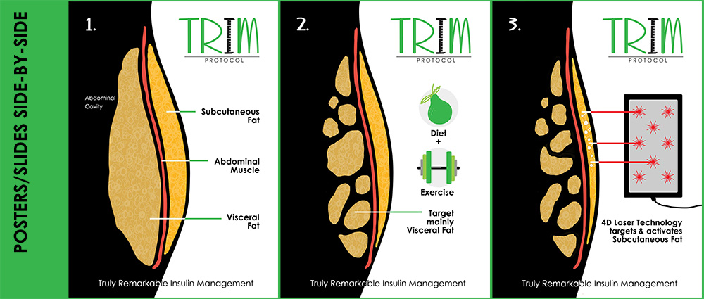
My client started a new part of his business and needed a logo, business cards and posters. The posters (which I illustrated and had printed at 22″ x 28′” and laminated) were needed for client demonstrations of the weight loss program. The 3-step process, which also includes laser technology, would be demonstrated to groups of about 20 people, so posters needed to be simple and easy to see. Logos needed added taglines, depending on their use.
Lumal Construction & Projects
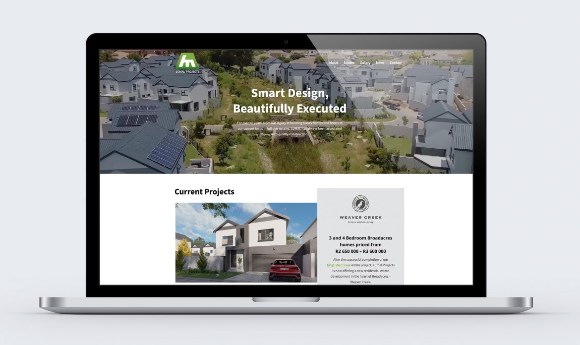
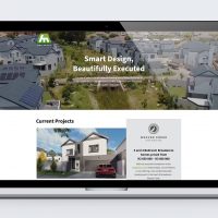
Upgraded version of the website I built for them a while back. Construction company needed a website to advertise their spec homes and act as a brochure for their new estates. I modernized their existing logo and then built the sites using WordPress.
Paula Marais Therapy (South Africa)
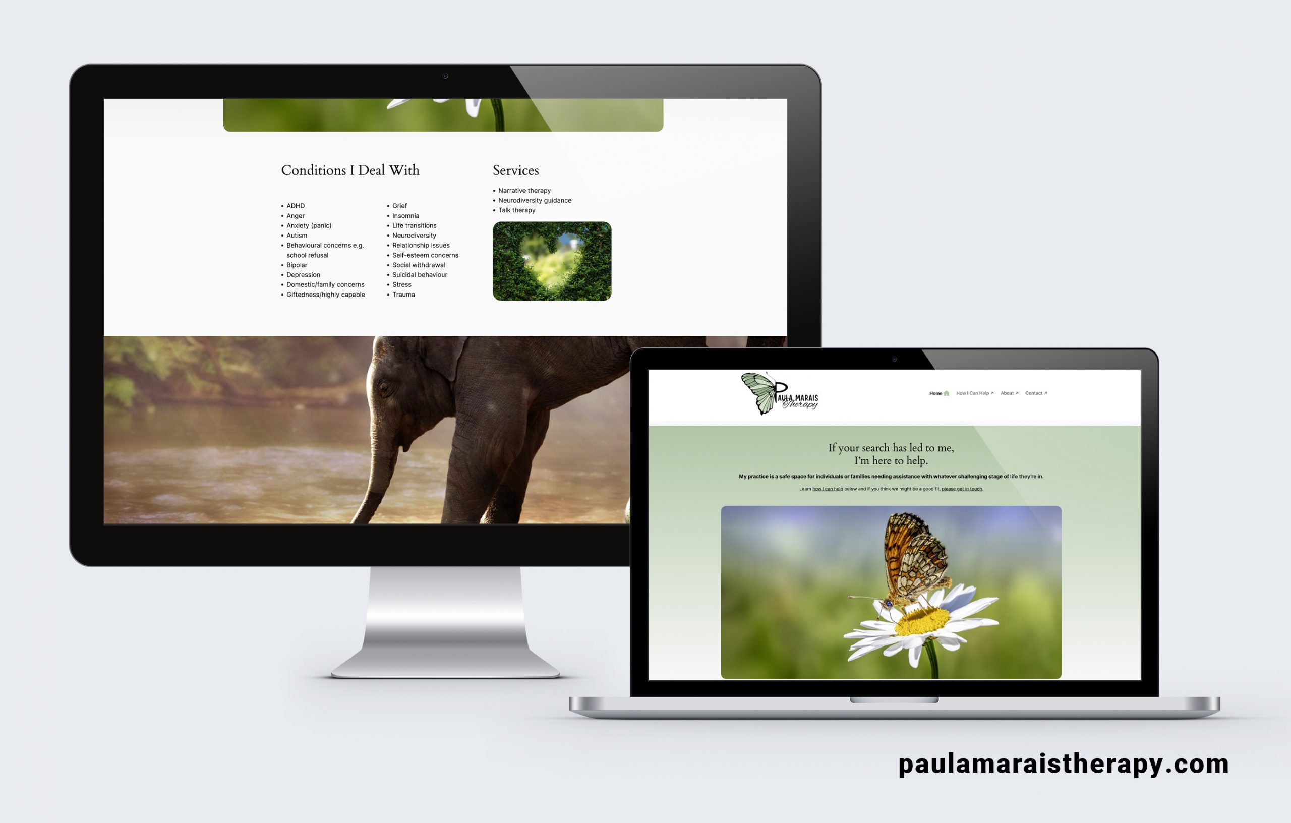
Logo, branding and simple WordPress website for my wellness counsellor/therapist client.
Salon Natalya (WA, USA)
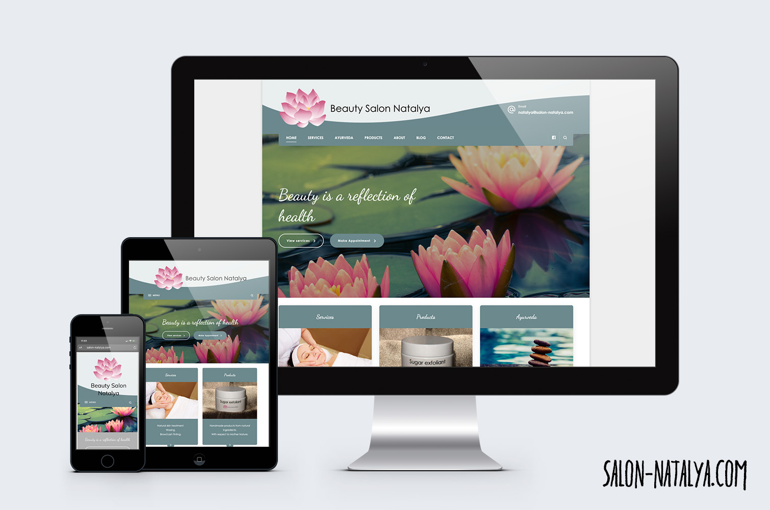
Logo modernization, rebranding, business cards and website build. Fully customized WordPress website, HTML and CSS hand coding as required to create unique design. Plugin intergration, content editing etc.
Astro Dragon (South Africa)
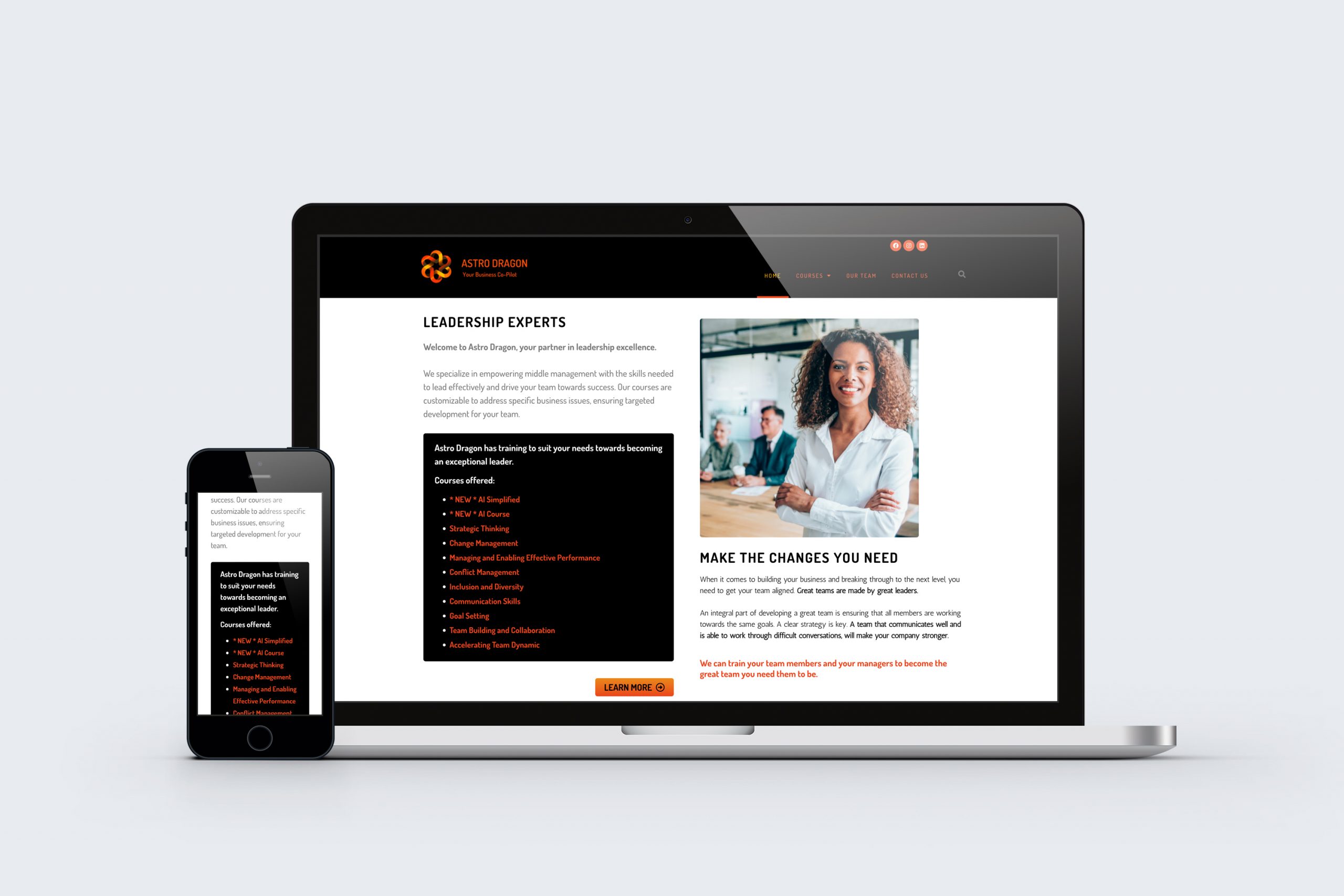
Re-design of existing corporate training website. WordPress website needed an update, to highlight courses, lighter backgrounds, but still to be clean and easy to navigate.
